
Base Graphics
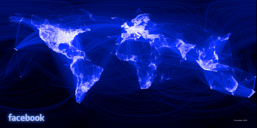
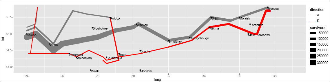
One of the best parts of R is its plotting capabilities. Take for example the following graphs visualizing Facebook friends, Napoleon's March to Moscow, or this wind map.
\
Most model output has an associated plot method which allows one to quickly
visualize the results of an analysis using a consistent interface.
In this lesson, we will learn about base graphics, which is the oldest graphics
system in R. Higher-level graphics packages like
lattice
and ggplot2 are also commonly used. ggplot2 will be covered next.
Base graphics use plot() function to create a plot. The type of plot depends on
the class of arguments given. plot(x, y) will give a scatterplot but if x is
a factor, it will give a boxplot. You also have high-level functions like
hist() to create an histogram or qqnorm() to get a QQ-plot. You can provide
additional arguments like type = to define the type of plot (p for
points, l for line, …), main = and sub = for title and subtitle, xlab
= and ylab = for axis labels.
plot(milk ~ dim, data = prod.long)
trend <- lm(milk ~ dim, data = prod.long)plot(milk ~ dim, data = prod.long)
abline(trend)
ggplot2
ggplot2 provides you with the
flexibility to create a wide variety of sophisticated visualizations with little
code. ggplot2 plots are more elegant than base graphics.
library(ggplot2)
qplot(dim, milk, data = prod.long, geom = "point")
The qplot function pretty much works like a drop-in-replacement for the plot
function in base R. But using it just as a replacement is gross injustice to
ggplot2 which is capable of doing so much more.
gg is for grammar of graphics, coined by Leland Wilkinson. What is grammar of graphics? Let deconstruct the plot below (and adding some variables by merging it to the health data set).
dairy <- merge(prod.long, health.wide, by = "unique")
ggplot(dairy, aes(x = dim, y = milk)) +
    geom_point(aes(color = parity)) +
    geom_smooth(method = 'lm')
There are two sets of elements in this plot:
Aesthetics
First, let us focus on the variables dim, milk and parity. You can see from
the plot that we have mapped dim to x, milk to y and the color of the
point to parity. These graphical properties x, y and parity that encode the
data on the plot are referred to as aesthetics. Some other aesthetics to
consider are size, shape etc.
ggplot(dairy, aes(x = dim, y = milk)) +
    geom_point(aes(color = parity, shape = mf)) +
    geom_smooth(method = 'lm')
Geometries
The second element to focus on are the visual elements you can see in the plot itself. There are three distinct visual elements in this plot.
- point
- line
- ribbon
These actual graphical elements displayed in a plot are referred to as
geometries. Some other geometries you might be familiar with are area,
bar, text.
Another very useful way of thinking about this plot is in terms of layers. You
can think of a layer as consisting of data, a mapping of aesthetics, a
geometry to visually display, and sometimes additional parameters to customize
the display.
There are three layers in this plot. A point layer, a line layer and a
ribbon layer. ggplot2 allows you to translate the layer exactly as you see
it in terms of the constituent elements.
layer_point <- geom_point(
    mapping = aes(x = dim, y = milk, color = parity),
    data = dairy,
    size = 3
)
ggplot() + layer_point
Exercise
Try to replicate the following plot shown below. The cross represents the mean,
which is not produced by default in boxplot. Hint to get it: see stat_summary.

Faceting
When dealing with multivariate data, we often want to display plots for specific subsets of data, laid out in a panel. These plots are often referred to as small-multiple plots. They are very useful in practice since you only need to take your user through one of the plots in the panel, and leave them to interpret the others in terms of that.
ggplot2 supports small-multiple plots using the idea of facets. Let us
revisit our scatterplot of dim vs milk. We can facet it by the variable mf
using facet_wrap.
ggplot(dairy, aes(x = dim, y = milk)) +
    geom_point(aes(color = parity)) +
    geom_smooth(method = 'lm') +
    facet_wrap(~ mf)
Note how ggplot2 automatically split the data into two subsets and even fitted
the regression lines by panel. The power of a grammar based approach shines
through best in such situations.
We can also facet across two variables using facet_grid
ggplot(dairy, aes(x = dim, y = milk)) +
    geom_point() +
    geom_smooth(method = 'lm') +
    facet_grid(mf ~ parity)